Yorgos Lanthimos had a deceptively simple directive for the “Poor Things” production design team: make the world look like nothing before. It was a creative endeavor that required the dual minds of Shona Heath and James Price, who set out to imagine an on-screen universe that evoked familiar inspirations while also appearing completely new.
“You'd say, 'Is it like this,' or 'Is it more like this?'” Heath recalls asking for guidance. “He was like, 'No, it's like nothing we've ever seen. It has to hit somewhere off scale. And its “off scale” – in the end we figured it out, but it was very difficult to determine it for ourselves. Sometimes what I wanted was really huge, or really small, or really complicated, or really simple. There were extremes at both ends of the scale. In the end we used miniatures and huge LED screens. Old techniques and new high-tech systems. “We use everything.”
“Where he was precise was that he wanted it to look like a 1930s studio movie made with today's technology,” adds Price. “He knew it needed to be built because Bella was something made up.”
The scene where Bella (Emma Stone) memorably steps out onto the dance floor in Lisbon was an existing location, which the designers adapted by adding a new floor, wall murals and different lighting.
(Reflector Images)
“Poor Things” is a Frankenstein-esque story about a young girl named Bella Baxter (Emma Stone) who begins life with a baby's brain in an adult's body. She begins to discover the world, going from London to Lisbon, via an elegant liner, from Alexandria to Paris. Each location evokes the real-world location, but puts a new spin on its geography and appearance, often drawing on historical paintings as design elements. The film is not set in a particular time period, allowing Heath and Price to look both to the future and the past when creating the sets. In London, Bella lives in the eclectic home of her creator, Dr. Godwin Baxter (Willem Dafoe).
“He's a surgeon, he's a maverick and he's confident,” Heath says. “So we had the confidence to take many architectural styles, put them together and put them back together. We put the obsession with the human body. The textures of the palate were in the atrium. There were ears on the ceiling. “We really start from the narrative.”
“We had a dogma of what the world could be,” adds Price. “We knew we would have electricity because we needed light for practical reasons. “Once we agreed we could use anything, we used plastics and then no material was banned.”
The house, inspired by the architecture of Sir John Soane, was built on a soundstage in Budapest over 16 weeks and included stairs, several rooms, a garden complete with a willow tree and a separate rooftop stage. To create the vast London skyline seen from the ceiling, Heath and Price used a series of flat cutouts in front of a digitally produced background. The smoke coming from the chimneys was added with visual effects.
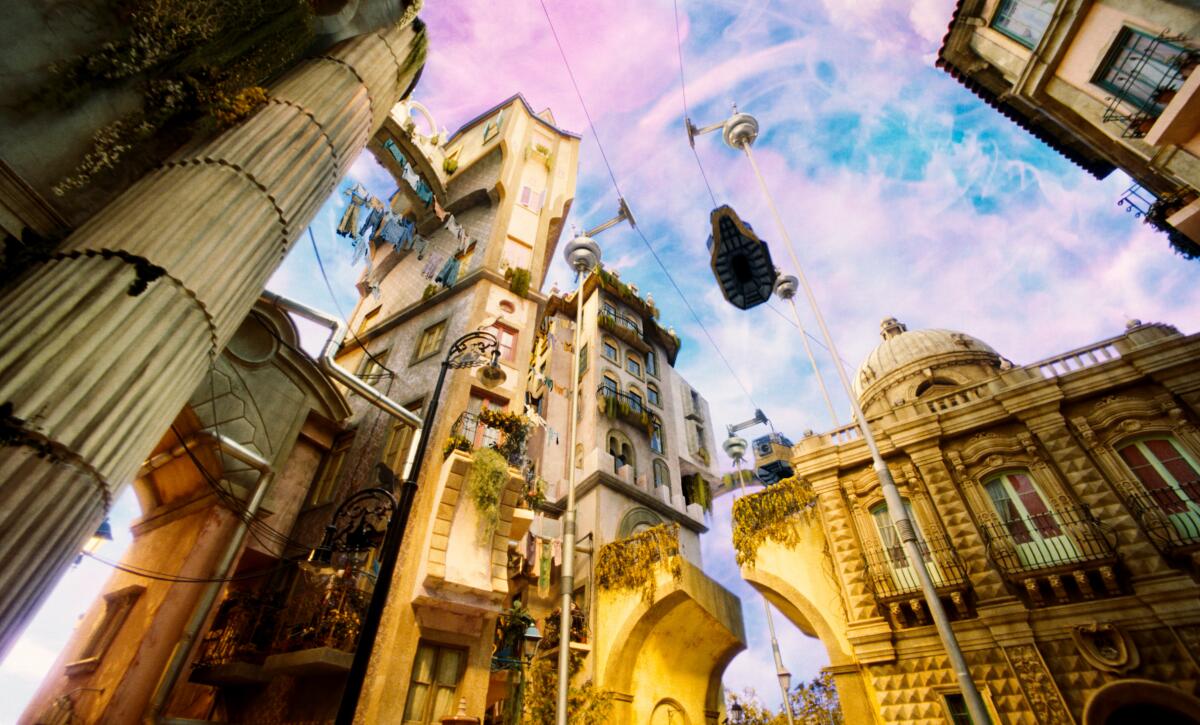
The Lisbon stages were built over 22 weeks on the largest sound stage in continental Europe.
(Reflector Images)
“It looks otherworldly, but still feels brilliant,” Price says. “There is a romance there. We borrowed a lot of techniques that we had learned in film school but had never used.”
The designs not only looked captivating on screen, but also helped the actors connect.
“A lot of these rooms totally influenced the way we performed, because you walk on set and you're like, 'Oh my God, this is awesome; This is incredible,'” says Ramy Youssef, who plays Dr. Baxter's assistant. “I was looking at a lamp and I said, 'Man, I have to act on the level of this lamp, because it's so real and 19th century, and it's like this… I can't turn the lamp down.' When you have that level of detail around you, you have to be present.”
The padded white floor of one room was a bit like walking on bean bag chairs. It was, Youssef says, “a great place to rest between scenes and then get yelled at for leaving a mark on it.”
Lisbon was an even bigger effort. The city and its interiors were built over 22 weeks on the largest sound stage in continental Europe. Because the streets are corrugated rather than flat, each section was built with steel frames and then clad, finished and painted. The tiles were stamped with a custom design and every detail was considered, including the carved elements on the buildings. Heath and Price were inspired by Lisbon itself, as well as the brutalist architecture of Ricardo Bofill and the French illustrator Albert Robida, whose flying cars can be seen in the sky.
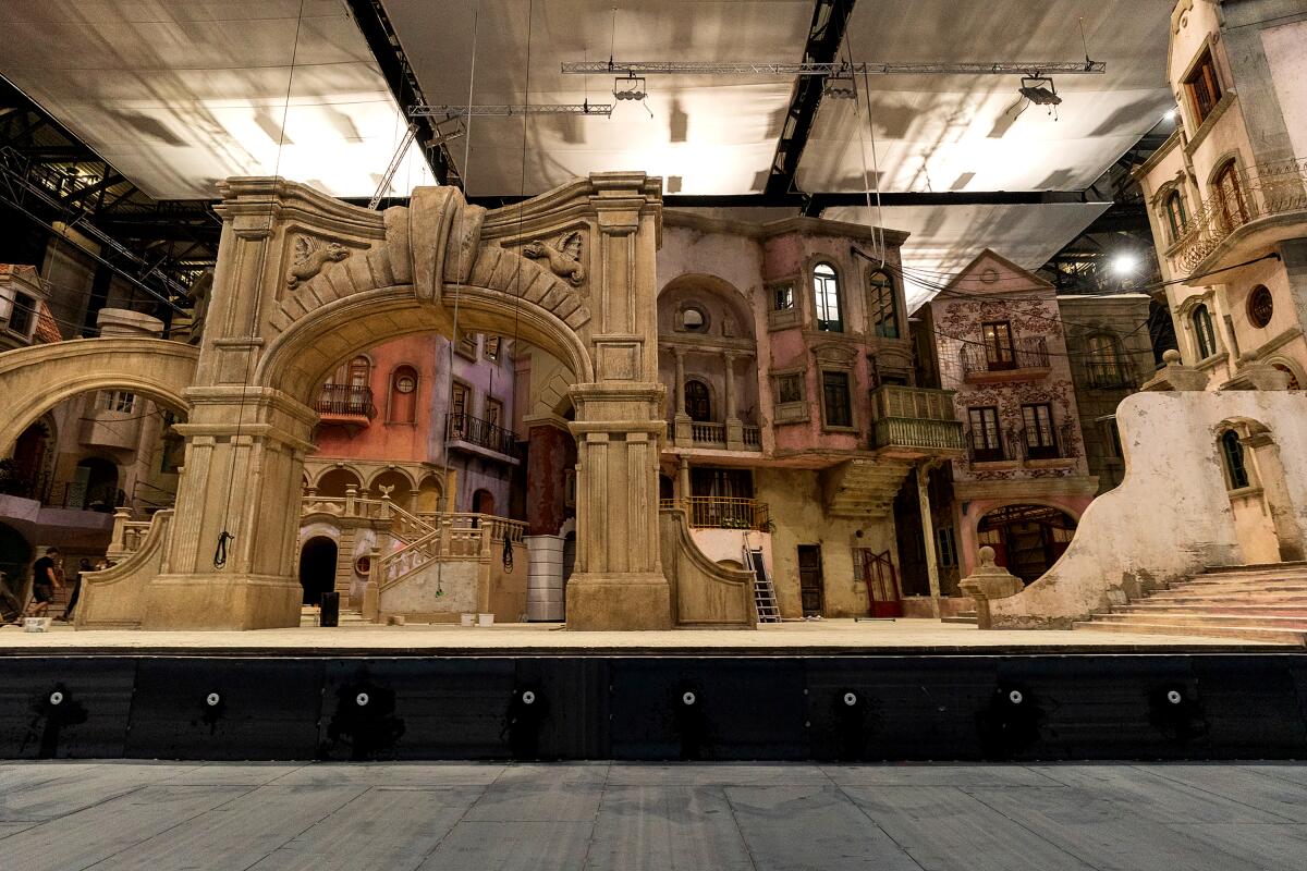
“For Lisbon, we ended up making a collage with photocopies of all kinds of buildings we liked and literally just cut everything out and reduced all the details we wanted,” says co-production designer Shona Heath.
(Reflector Images)
To flesh out the landscape with the sea, there was a water tank and a backdrop over 170 feet long and over 60 feet high. It took three scenic artists to paint.
“We wanted to distill the essence of the city, condense it and bring it together so we could have more of a sense of place in a smaller area,” Heath says. “For Lisbon, we ended up making a collage with photocopies of all kinds of buildings we liked and we literally just cut it up and reduced all the details we wanted. We put it together in a really carefree way. In the end, I think we bring a lot of energy to the cities because we take advantage of everything.”
His version of Paris is less colorful, with an emphasis on the monochromatic feel of the stone buildings. The team was inspired by Luigi Loir and Edgar Degas' paintings of the city in the snow, and built another expansive set where Bella could walk around the square and then enter the brothel, her bedroom, and look out over the square.
The cruise ship was equally large, with two floors and an outdoor deck built in front of an LED screen. Alexandria, taken from Massimo Listri's book “Cabinet of Curiosities” and Hieronymus Bosch, was the only place that was not created as a life-size set.
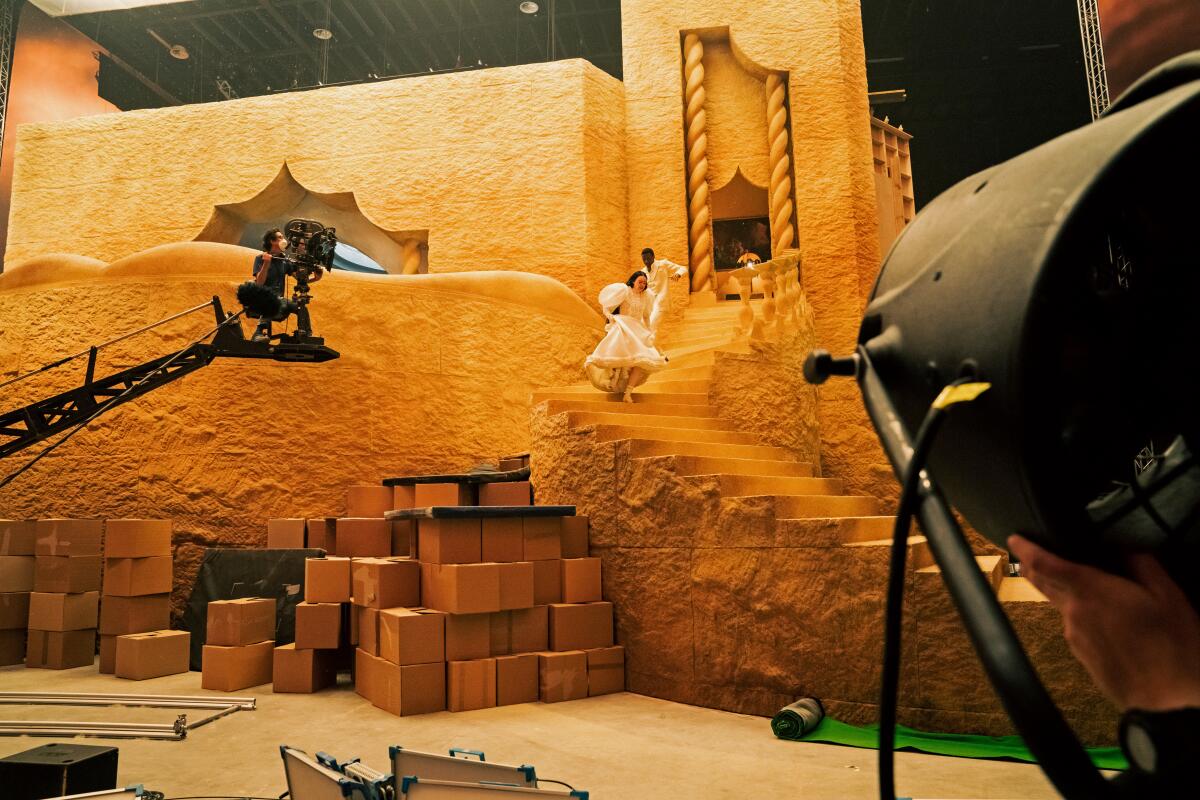
“It was a huge miniature,” co-production designer James Price says of the Alexandria set. “It was 15 feet off the ground, because the steps went down, and it also had a wraparound LED screen.”
(Atsushi Nishijima/Searchlight Images)
“It was a huge miniature,” says Price. “It was 15 feet off the ground, because the steps went down, and it also had a wraparound LED screen. We decided it was going to be an island, even though Alexandria is not. We weren't really sure how to do the moment where Bella sees the misery. It’s a defining moment in her story, but you’re not there long enough to warrant a huge set being built.”
Only a few scenes in the film were shot outdoors. The scene where Bella memorably takes to the dance floor in Lisbon was an existing location, which the designers adapted by adding a new floor, murals and different lighting. The medical schools and the church were also filmed on location, as was the forest. But of course Price and Heath didn't want to simply use the existing forest.
“All the trees that cross [the scene] We put them up, they were suspended from cables,” Price says. “There are trees with question marks that you can spot if you look for them.”
In fact, there is nothing in the world of “Poor Things” that the viewer can take for granted, from the trees to the landscapes to the skies, that has been visually enhanced. British artist Chris Parks, known for his fluid paintings, created textures for the skies that were filmed and then added digitally.
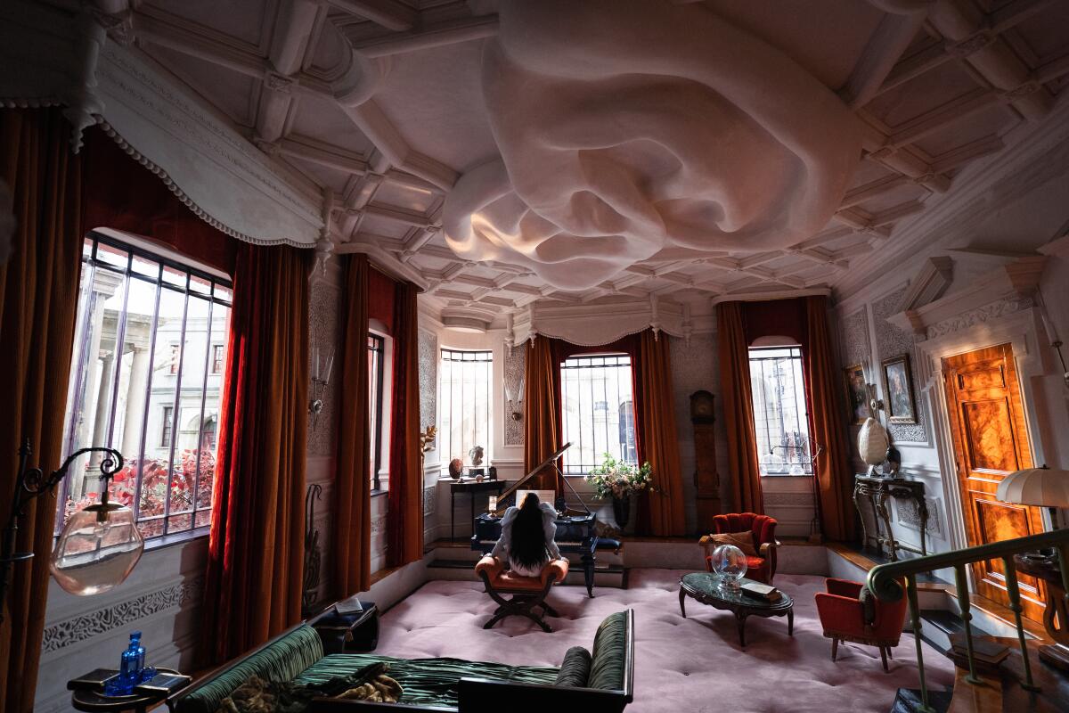
“There were ears on the ceiling,” says “Poor Things” co-production designer Shona Heath. “We put the obsession with the human body,” she adds about the house of surgeon Godwin Baxter.
(Atsushi Nishijima/Searchlight Images)
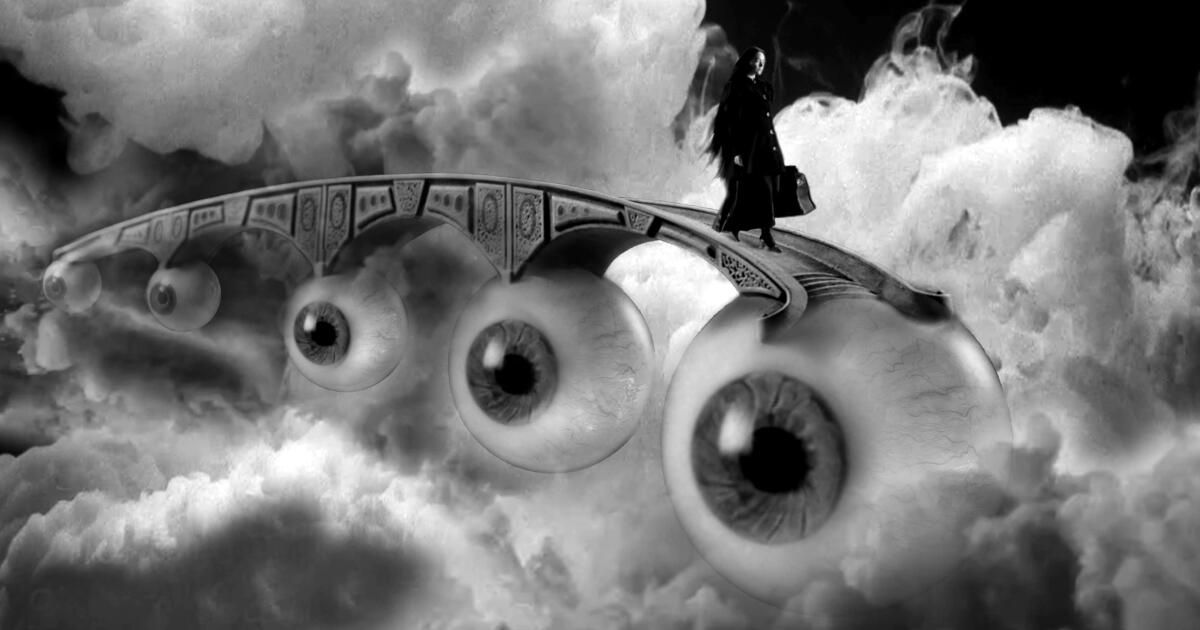
“Even our skies have a physical value that didn't start out as skies,” Heath says. “And everything that may be there [on set] It was there. Using the chapter titles we made a real model fish for her to sit on. We built an eye bridge so she could cross. The smoke was filmed in a tank and the shot was reassembled as a composite. Everything was dismantled, filmed and reconstructed. The details and craftsmanship didn’t stop.”
“Poor Things” marks Heath's first time working as a production designer on a film and is Price's biggest project to date. Although they were initially unsure about having two production designers on a film, their collaboration proved fruitful. Getting the sets to look so unusual required a large team of craftsmen all on the same page working against established norms.
“There had to be a sense of 'it doesn't have to be this way,'” Heath says. “And once the people on our team, whether they were builders or other designers or painters, understood it, they really ran with it and loved it. It was fun, and also very difficult, where we all worked with an absurd and improbable approach to design and construction.”
“From the way everyone responded and watched it with the audience, it's clear that everyone is universally impressed,” adds Price. “It seems like we achieved what we wanted.”
Envelope writer Lisa Rosen contributed to this story.

