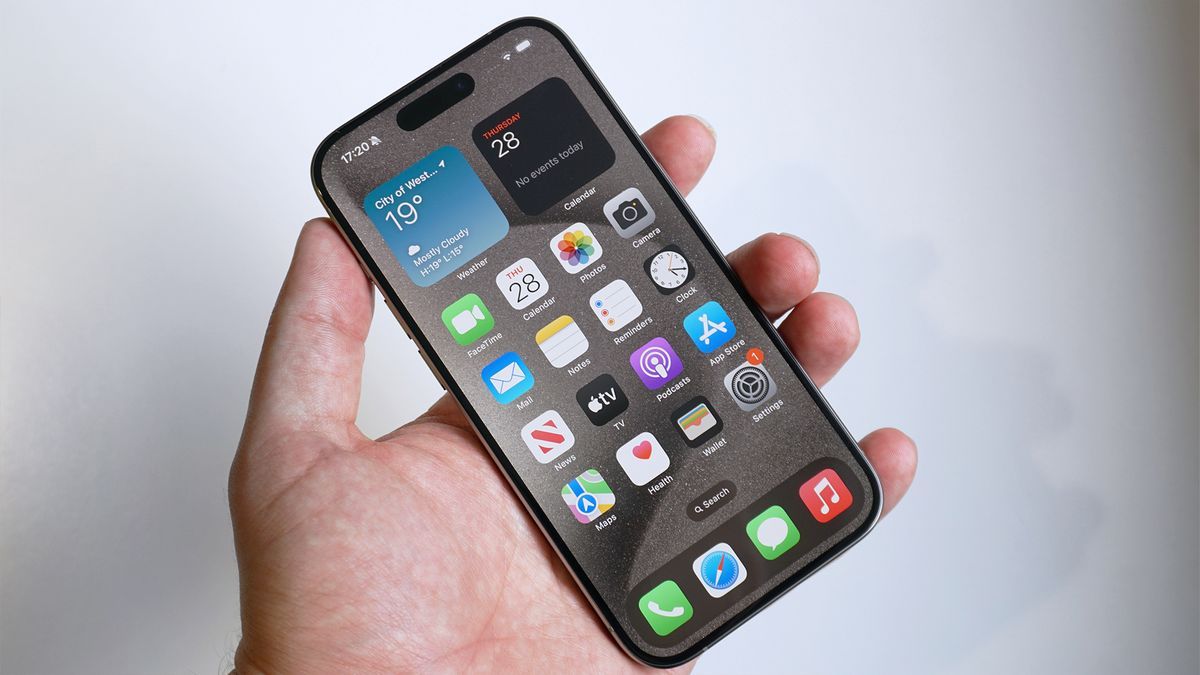
It's hard to imagine the iPhone 14's notch or the iPhone 15's Dynamic Island looking any different than today, but of course there will have been a full design and review process behind them, and some unused ideas simply slipped through the cracks.
According to information obtained by MacRumors, a variety of different designs were explored before the ones we now have finalized. Some images of mock-ups have also been put together to show what the rejected ideas would have looked like.
One of the ideas that was apparently being considered was a pop-up sidebar to the right of the screen, next to the notch, a sidebar that would be used to display the time, signal strength, battery level, and others. key data.
Apple also reportedly thought about extending the notch across the entire top of the screen – meaning less notch, plus an Android-style status bar – which may have had the added benefit of giving users a little more of battery life.
A design for life
Apple's design team was also busy introducing Dynamic Island, which first appeared on the iPhone 14 Pro and iPhone 14 Pro Max. One of the rejected ideas here was an entire row of status icons below the selfie camera.
It seems that Apple's designers also toyed with the idea of having a dynamic island that was permanently elongated (in that case, just an island) before deciding that it should change shape and size depending on the context.
Head over to MacRumors to see the full set of mockups and imagine what could have been. Some of these ideas may appear again in the future, as Apple continues to tweak the look of its iPhone series.
It's also possible that both the notch and the dynamic island could eventually disappear entirely, if Apple can figure out how to make the selfie camera and the sensors next to it sit below the screen somehow (like Samsung has done with the Galaxy Z Fold 5). .


