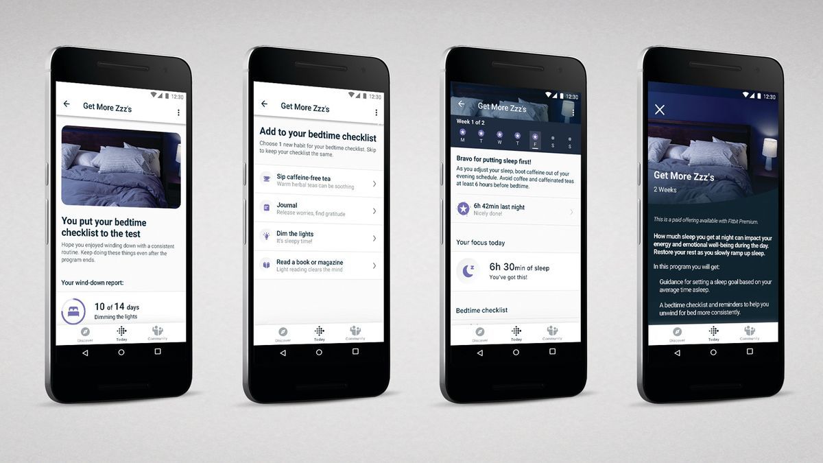
The Fitbit app is changing. Last week, the Google-owned health and fitness app (which is one of the best fitness apps overall) changed the way its heart rate page was presented. This time, it's the turn of stress management, body response, and mindfulness.
These changes, which 9to5Google spotted, were made with Google’s unified app design language, Material 3, in mind to achieve consistency across apps. Since Fitbit.com is being shut down and migrated to the Google Store, it’s safe to assume that Google is keen to keep the Fitbit app consistent with the rest of its Android and Pixel portfolio.
The changes, which will go into effect with update version 4.26.1, will involve toolbar tabs replacing chronological timelines. Stress Management and Body Response will have “Day” and “Week” tabs to better track the past seven days, while Mindfulness will have “Week,” “Month,” and “Year” tabs to better track meditation streaks.
It appears that some features have had their names changed, too: the “Responsiveness” metric below the Activity Score has been renamed “Physical Calm,” and “Exertion Balance” has been renamed “Activity Balance.” The changes can also be seen in posts from eagle-eyed users on the Fitbit subreddit.
It is unclear whether these name changes imply a change in how your scores are calculated, but we do not believe this is currently the case.
To get the updated version of the app without waiting for an automatic update, you'll need to head to the Play Store app. From the menu icon, tap the “Update” button next to the Fitbit app.


