In a move no one expected, Premier League champions Manchester City have revealed their own custom font that will be used on their kits for the 2024-25 season.
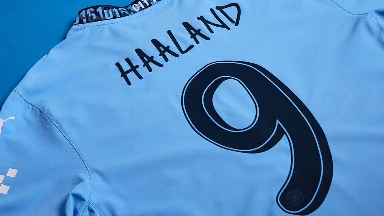
The typeface has been created in collaboration with musician Noel Gallagher, former member of Oasis, who also happens to be a lifelong City superfan. The design is based on Gallagher's handwriting and will be used to indicate players' names and numbers next season.
It began with Gallagher writing the name and team number of each and every first-team player, which in turn was transformed into a personalized font that will be applied to City's new kits.
While it's certainly distinctive, there's more than a whiff of the dreaded Comic Sans to it.
Man City revealed their new 2024-25 home kit last month during the lead-up to last season, on the same day as title rivals Arsenal. The campaign ended with City winning the English league title for the fourth consecutive season on the final day.
The design of the shirt from manufacturer Puma features the local telephone code “0161” for the city of Manchester, which can be found woven into the details and trim.
The new kit will feature the hand-drawn font when worn by the men's team in all Champions League and domestic cup matches next season. However, it will not be seen in the Premier League as the rules stipulate that clubs must select the lettering and numbering of their kits from a variety of pre-approved style and color combinations that were introduced last summer.
Many major clubs create new custom fonts to use on their official jerseys. For example, Real Madrid recently launched a new style of arabesque lettering to adorn their new immaculate white 2024-25 home kit.
Several national teams have also produced unique lettering to accompany their uniform releases, with mixed results.
City striker Erling Haaland's Norwegian team caused a bit of a stir last year when it debuted a bold font inspired by ancient Norse runes to accompany its 2024 kits.
While the numbers and letters look great in isolation, they are very difficult to read from more than a few meters away, especially when the players wearing the jerseys are running around going about the business of a game. real football.
Still, why let the fact that a font is barely legible ruin what would otherwise be a lovely little creative design?