In addition to the standard range of playing shirts (home, away, third alternates for outfield players and a full set for goalkeepers), clubs also equip their players and staff with a wide range of pre-match clothing.
While most match-worn shirts are becoming increasingly abstract and experimental, most tend to stick fairly conservatively to variations of the club's traditional colours.
However, when it comes to the uniforms worn by the players during warm-ups, there are no gambles. Designers have been given the freedom to express themselves, bring their wildest creative visions to life, and make a statement that will grab the world's attention.
Of course, that doesn't necessarily mean they're all artistic triumphs. With freedom of action, there's always the danger of things getting out of hand, and we're here for that.
Below is a selection of the warm-up kits worn by star players in leagues across Europe this season (including the Premier League, La Liga, Bundesliga, Serie A and Ligue 1), ranging from the sublime to the ridiculous. And if you disagree with the verdicts, no problem. It is art, after all.
THE GOOD
Milan have been getting their kits right this season and the shirt unveiled before the match is no exception. The base colour is a whitish shade (putty, bordering on ecru) to which a richly textured gold pattern has been applied which, if you put your mind to it, looks like a freshly raked golf bunker.
Ajax (Adidas)
Ajax's warm-up shirt features an intricate pattern made up of hundreds of tiny scrolls, all of which embody the three X's found on Amsterdam's official flag. To save you a potentially dangerous internet search, we can tell you that the symbols actually represent St Andrew's crosses and are said to protect the Dutch capital from fires, floods and plagues. Sadly, they couldn't protect last season's Ajax squad from the club's worst Eredivisie finish this century.
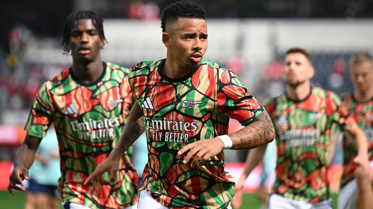
Arsenal have taken up the African heritage theme that was used so well on their 2024-25 away kit and then jumped straight in. The Gunners have a great track record in recent years when it comes to pre-match wear with really over-the-top designs that somehow really hit the mark, and this one is no exception. We expect this model to achieve cult status.
Barca brings us a pleasant, muted dark blue hue, which is enhanced by gold trim and a graphic of the club crest printed on the fabric. Perhaps the odd “envelope” neckline is our only cause for concern, mainly because it looks like something you dress babies in.
It's not to everyone's taste, but we're slowly getting used to the weirdness of Chelsea's “molten metal” shirt concept this season. Like the Blues' home shirt for the 2024-25 season, the pre-match shirt is covered in a scattered graphic that's sure to produce a hypnotic effect if you see all 43 players currently listed in the club's first-team squad warming up together.
A lively reimagining of the Turkish club's familiar yellow and blue colours, this pre-match shirt comes with a striking stripe pattern consisting of slanted comb-shaped diamonds.
For reasons that are still not entirely clear, Juventus have opted for a celestial theme for all their kits this season and the pre-match effort follows the same pattern. What looks from afar like a polka dot design is actually a “lunar eclipse” pattern showing many moons silhouetted by the neon pink and yellow glow of outer space.
A minimalist shirt that could easily pass for a home shirt. The red fabric is printed with a graphic crest all over, while Liverpool's traditional colours always pair well with vibrant yellow. Using the same template as Barca means this shirt has the same confusing romper neckline, but overall it's a nice looking shirt.
Lyon (Adidas)
The Gones They've applied a graphic to their warm-up shirt that's reminiscent of traditional Japanese woodblock art. The wavy print gives off a poignant maritime vibe, punctuated here and there with wisps of red foam. It stays just on the right side of good taste and avoids being overdone.
Having relied heavily on nostalgia in this season's new kit, Newcastle have taken a more modern approach with their pre-match shirt. Taking direct inspiration from their nickname, the Magpies have covered the shirt in feathers to create a unique black and white wallpaper effect that is a real eye-catcher.
Nobody rocks plain white quite like Real Madrid, whose pre-match shirt is basically a simplified interpretation of their usual home colours, but with a stylish star-shaped graphic printed all over it.
It looks like it could easily pass for a mid-2000s away shirt, and has a slight retro feel to it. A pristine white field adorned with a light touch of tonal red on the shoulders and flanks. Very good.
The Spanish side has used a violet base that, at first glance, looks like it has rose petals scattered across the torso, like in the movie “American Beauty.” In fact, it is a geometric pattern made up of triangular mosaics.
BAD
Concrete grey is the new black for Atletico this season as they have completed their paving-slab-inspired away kit with a matching pre-match shirt.
Dortmund have used their famous home colours to create a warm-up shirt that is covered front and back with a cracked fractal diamond pattern. The effect is bursting with kinetic energy, to the point of inducing migraines.
Despite being one of the least inspiring themes ever devised for a football shirt, City have taken the Manchester area telephone code concept of their home shirt one step further with their warm-up kit. The digits of the prefix “0161” appear in a messy pattern woven into the fabric. Sorry if we didn't take this call.
A rare mistake for United this season, who have unveiled a series of incredibly stylish home kit with a retro feel for 2024-25. The warm-up shirt has the same “M” pattern as their new away shirt, but the execution is much rougher. Mark “M” for “maybe not.”
Using the same “dazzle camo” design they use on their new on-field uniforms, the Saints have created a headache-inducing barrage of lines, angles and checks to flummox their opponents before kickoff.
Sporting has basically created a black base dotted with an explosion of bright green grainy pixels. It looks like what you'd see on the screen when a game crashes on an Atari 800 console (just ask your parents).
The ugly one
An absolutely tacky shirt from every angle and point of view. Bayern have had very inconsistent kit designs for the 2024-25 season, and this patchy disaster clearly falls into the second group.
Benfica have proven beyond a doubt that sometimes less is more. The Portuguese club's warm-up shirt contains so many contrasting graphics that the result is an almost instant feeling of dizziness. The shapes are meant to represent the claw marks of an eagle, the club's emblematic bird of prey, but to us it looks more like a pile of old, discarded hubcaps.
Nike is playing with Inter's traditional colours this year, and the poor… Nerazzurri As a result, they are really going through a very tough time. It's grim, patchy and gruesome – three words you would never expect to be associated with Inter when it comes to kits.
PSG's warm-up shirt, which uses the club's traditional colours, has a faux paint splatter print that looks like it was used by a painter and decorator during a particularly chaotic home renovation. It's a mess and there are too many things going on at once.
Spurs have been forced upon them a suspiciously similar “identikit” design to Inter's. Covered in a mottled, vaguely abstract pattern that appears to include various stencils, doodles and random splurges, the design looks like something you'd find upholstering the seats of a train. Kind of depressing.
A pretty terrible design from the Hammers, who opted for some sort of bleach-dye effect but ended up with a shirt that looks like the result of a horrendous night in A&E.