monday.com and Wrike are two of the top-rated project management software solutions out there, and for good reason. They both offer great features, a relatively low learning curve, and good scalability across multiple pricing plans.
However, these platforms are not completely identical and each is designed for slightly different audiences. Wrike is a good option for teams that need a free plan for many users, but its paid tiers are more expensive. On the other hand, monday.com offers more affordable paid plans and additional features like a digital whiteboard and document management.
In this review, we compare Wrike vs monday.com across several categories to help you decide which project management software is the right choice for your business.
1
Monday.com
Employees by company size
Micro (0-49), Small (50-249), Medium (250-999), Large (1000-4999), Enterprise (5000+)
Any size of company
Any size of company
Characteristics
Agile development, analytics/reporting, APIs and more
2
Fast base
Employees by company size
Micro (0-49), Small (50-249), Medium (250-999), Large (1000-4999), Enterprise (5000+)
Medium (250-999 employees), Corporation (5000+ employees), Large (1000-4999 employees), Small (50-249 employees)
Medium, Business, Large, Small
Characteristics
Agile development, analytics/reporting, APIs and more
3
Smart Sheet
Employees by company size
Micro (0-49), Small (50-249), Medium (250-999), Large (1000-4999), Enterprise (5000+)
Any size of company
Any size of company
Characteristics
Agile development, analytics/reporting, APIs and more
Wrike vs Monday: Comparison Table
| Characteristics | ||
|---|---|---|
| Star rating | ||
| Initial price (billed annually) | ||
| Free plan | ||
| Project views | ||
| Project templates | ||
| Automation templates | ||
| Integrations | ||
|
|
Wrike vs Monday: Pricing
Both Wrike and monday.com offer five different pricing plans, including a free version, but the difference quickly becomes apparent when you start looking at the total cost. For starters, Wrike’s free plan supports an unlimited number of users (but doesn’t offer as many features), making it a better option for small businesses. Meanwhile, monday.com’s free plan only supports two users, which isn’t very useful for teams, but does offer a good amount of features.
Entry-level paid plans cost about the same on both platforms, but Wrike’s pricing quickly escalates to nearly $25 per user per month, while monday.com’s two mid-tier plans cost less than that. This is one of the main reasons why Wrike only scored 3.5/5 for pricing, while monday.com scored 4.3/5. Both platforms also offer pricing plans for enterprise project management software, but pricing is only available upon request.
Wrike Pricing
- Free:$0 per user per month for unlimited users.
- Equipment:$9.80 per user per month billed annually.
- Business:$24.80 per user per month billed annually.
- Company:Please contact sales for a customized quote.
- Pinnacle:Please contact sales for a customized quote.
There is a 14-day free trial available for all paid Wrike plans. To learn more, read the full Wrike review and see this list of Wrike alternatives.
monday.com prices
- Individual:Free forever up to two seats.
- Essential:$9 per seat per month billed annually, or $12 per seat per month billed monthly.
- Standard:$12 per seat per month billed annually, or $14 per seat per month billed monthly.
- Pro:$19 per seat per month billed annually, or $24 per seat per month billed monthly.
- Company:Prices available upon request.
A 14-day free trial is available for all monday.com paid plans except Enterprise. To learn more, read the full monday.com review and see this list of monday.com alternatives.
Wrike vs Monday: Feature Comparison
Task management
Winner: Tie
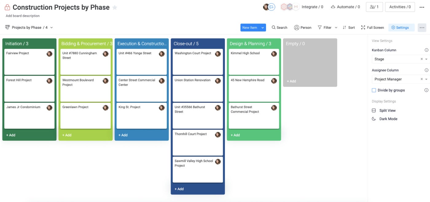
Wrike and monday.com offer very similar task management features: Wrike scored 5/5 and monday.com scored 4.9/5. With Wrike, I was able to sort tasks by due date or priority, or add subtasks for more complicated projects. Wrike also offers 10 project views to choose from, including popular ones like kanban boards and Gantt charts.
monday.com also made it easy to sort tasks by due date and add subtasks. Similar to Wrike, it also offers 10 views, including kanban boards and Gantt charts, as well as a workload view for light resource management. It also offers other features that I found useful, such as color-coding columns to visually track task statuses.
Team collaboration
Winner: monday.com
Both Wrike and monday.com offer features that make team collaboration simple. In Wrike, I was able to share workflows internally and externally and tag other team members in tasks and conversations to keep projects moving forward. I also appreciated that teams could make changes to task descriptions at the same time thanks to the Live Editor feature.
monday.com also lets me tag other people in comments to let them know, which is pretty standard. Multiple team members can also track time on the same tasks simultaneously, which is great. monday.com supports project time tracking on the Pro and Enterprise plans, while Wrike offers it on the Business, Enterprise, and Pinnacle plans.
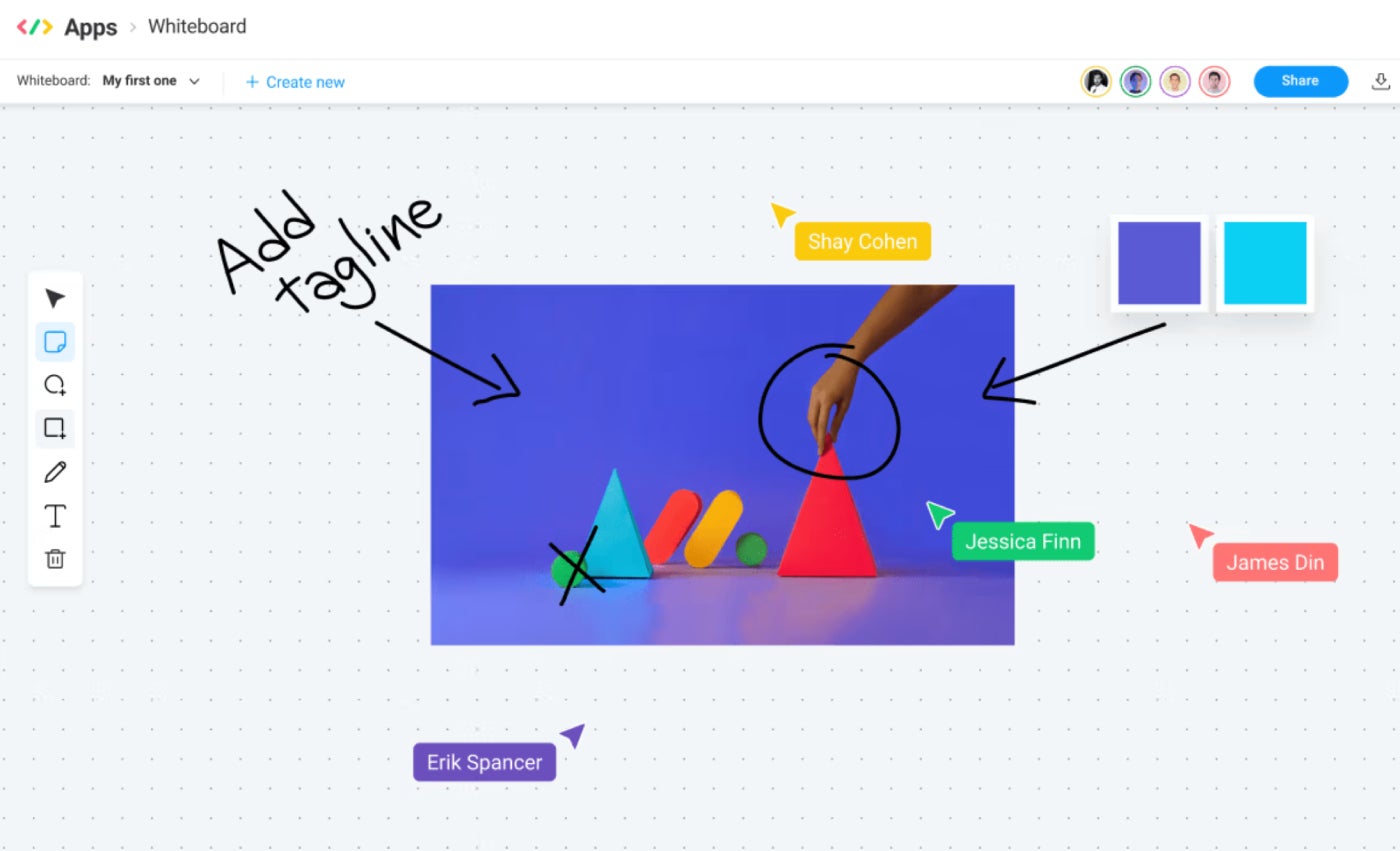
I also liked the Monday Workpapers module, which allows teams to edit documents in real time, embed boards in those documents, and create live action items. This simplifies brainstorming, taking meeting notes, and creating project plans, and eliminates the need for an additional app. Wrike doesn’t offer a similar whiteboard or document management feature.
Automation and workflow management
Winner: monday.com
Both Wrike and monday.com offer code-free automated workflows on select paid plans. Wrike limits the number of monthly automation actions per user, while monday.com gives each account a fixed amount for the entire workspace.
Wrike’s automation rule builder allows you to get more granular about automations. For example, you had the option to create automations at the account or space level, but it doesn’t offer templates for automations, which makes them a bit harder to create. Wrike also imposes a lot of limits in terms of how many automation actions can be performed per minute, etc., which were difficult to parse through.
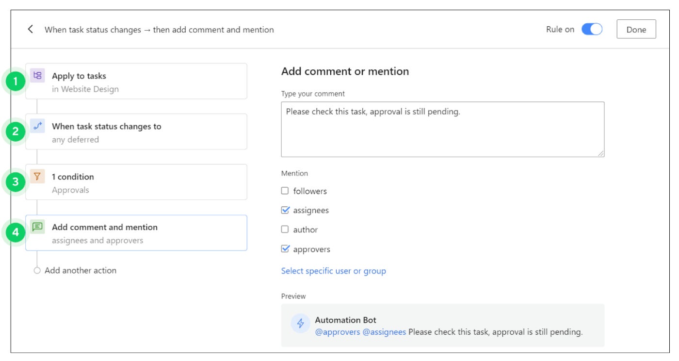
Meanwhile, monday.com comes with a number of automation templates that I can customize, or I can create my own automation from scratch. The workflow builder was also more intuitive and easier to understand than Wrike. You can’t customize monday.com’s automations to the same level as Wrike, but many teams will find the ease of use worth it.
Pros and cons of Wrike
| Advantages | Cons |
|---|---|
| Enterprise-grade security on all plans. | The features of the free plan are quite limited. |
| Unlimited users on the free plan. | Pricing plans are more expensive than monday.com. |
| Native time tracking included in higher paid plans. | There is no monthly billing option available. |
| More integrations than monday.com. | Fewer templates than monday.com. |
| Provides resource management and workload allocation capabilities. |
Pros and cons of monday.com
| Advantages | Cons |
|---|---|
| Unlimited boards for all paid subscriptions. | The free plan is limited to only two users. |
| More templates than Wrike. | Advanced security only available on the Enterprise plan. |
| 24/7 customer support for all paid plans. | Most administration and control features are limited to the Enterprise plan. |
| The whiteboard collaboration feature is available on all plans. | |
| The pricing plans are more affordable than Wrike. |
Should your organization use Wrike or monday.com?
Choose Wrike if…
- Want to have more integrations to choose from.
- You need a free plan for more than two users.
- You want more robust resource management capabilities.
- You need the ability to map critical paths for projects.
Choose monday.com if…
- You are looking for more affordable pricing plans.
- Want to have more templates to choose from.
- You need an automation builder that comes pre-loaded with templates.
- You like having access to customer support 24/7.
- Your team's collaboration will benefit from the included brainstorming tools and document management capabilities.
Review methodology
To compare Wrike vs. monday.com, I signed up for free trials of both programs. While writing this review, I compared features like project views, tasks and subtasks, document management, time tracking, automations, integrations, and security. I also considered other factors like price, customer support, and user interface design.

