Last year was the warmest on record. The graphic artists of the environmental movement tried to warn us. Their posters were intended to scare people with images of ecological ruin or glorified nature, clean air and water, sun and greenery. Some offered clever slogans and disturbing images. Whatever their approach (brilliant, witty, dark, direct, even sexy), they were looking for an image, a phrase, that could change enough minds to literally save the world.
Through February 25, an exhibition at Poster House in Manhattan demonstrates these visual and rhetorical styles, and how they reflect the changing strategies of the evolving movement. There are 33 posters on view, along with dozens of postage stamps and a pair of Vivienne Westwood socks.
Environmentalism began to hone its voice in the 1970s, with roots in the counterculture and protests against the Vietnam War. Robert Rauschenberg designed the official poster for the first Earth Day, in 1970. In a deadpan call to patriotism, grim scenes of deteriorating ecologies frame a bald eagle. The first work in the exhibition, a 1961 request for drinking water by Hans Erni, shows a gruesome skull in a glass. The choice, the artists argued, was between peace and poison.
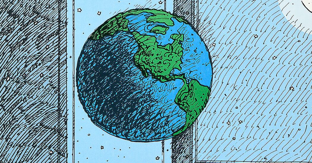
This is the environmental movement as a marketing problem. First, people must know your product; then you must persuade them that they need it. Perhaps a healthy planet seems like an obvious good. “Give the Earth a chance,” reads a 1970 poster by Milton Glaser; The big blue marble we all inhabit is drawn floating in a living room. As Earth Days and global conclaves flash by on billboards, it’s starting to feel like raising awareness isn’t enough. The tones of the posters become acidic. An austere illustration by Yen-chang Cheng and Hung-yu Chen from 2008 shows a polar bear cub floating over its mother’s corpse.
Flashes of optimism and calls to rally around children and animals characterize several examples from the 1980s, including a pro-tree poster by Eric Carle of “The Very Hungry Caterpillar” fame. In Rauschenberg’s 1992 print for the United Nations Earth Summit in Rio de Janeiro, a baby takes a nap in a stroller. “I am committed to making the Earth a safe and hospitable home for present and future generations,” she says.
There are also beginning to be suspected counterforces at work – what Vince Packard, a journalist critical of consumerism, called “hidden persuaders” in his 1957 book – who could sell an anvil to someone who is drowning.
All the materials on display arise from sincere convictions, don’t they? On the back wall is a poster version of the famous “Crying Indian” television commercial, with a lone tear spilling down Iron Eyes Cody’s weathered cheek. A sticker on the wall tells you something you might know (that this “Native American” is actually an Italian-American actor) and something you might not: the Keep America Beautiful group behind the ad is a consortium of beverage companies.
This context puts the text in a different light. “People are starting to pollute,” the sign says. “People can stop it.” The campaign attempted to shift the responsibility onto bedbugs and away from brands’ disposable packaging. Likewise, the idea of a “carbon footprint,” which makes individual consumers the problem and not the fossil fuels sold to them, is an invention of advertising specialists (the mega-firm Ogilvy & Mather). , hired by BP in 2004.
Little by little, environmental artists became wise. The program presents examples of the so-called culture interference mode developed by activists in the 90s. (Think Adbusters magazine or Yes Men).
A pitch-perfect parody of a Volkswagen advert by British designer Barnbrook is one of several introduced at Paris bus stops ahead of the COP21 climate conference. There is the usual car and, on top of that, the well-known Volkswagen font. But the text says, “We’re sorry we got caught,” a reference to the automaker’s emissions-cheating scandal and a rebuke of its own sans-serif apology published in newspapers just days earlier. The idea is less to attract hearts to green causes than to protect minds against greenwashing.
But advertising companies are also creative. The most morally ambiguous poster is one from 2017 that shows a wealthy woman posing with a megaphone on a luxury speedboat while, just behind her, a fishing boat drags a whale and bloodies the sea. “For those with an environmental conscience,” the copy says. “And $72,000.” A cruel parody of greenwashed luxury? No, it’s an ad, created by Ogilvy & Mather, for an electric hybrid Lexus.
Perhaps realizing they can’t outspend corporate public relations, some contemporary poster makers forgo blue-sky thinking and bitter wit to promote specific policies. Gavin Snider’s earth-toned design from 2019 depicts an animated scene centered on the giant fountain built in Flushing Meadows Corona Park for the 1964 World’s Fair. It reads simply: “The Green New Deal.” In 2023, Jan Martijn Burger’s poster urging divestment from fossil fuels adopted the nostalgic style of the WPA engravers. In the arc that this program describes, the mood of the environmental movement gradually loses joy.
We try to warn you! Environmental crisis posters, 1970-2020 Through February 25 at Poster House, 119 West 23rd Street, Manhattan; 917-722-2439; posterhouse.org.