Truly support
independent journalism
Our mission is to provide unbiased, fact-based reporting that holds the powerful to account and exposes the truth.
Whether it's $5 or $50, every contribution counts.
Support us in offering journalism without agenda.
YoLocated on Portland, a small island off the coast of Dorset, The Clifftops is a collection of five idyllic holiday homes available to rent through holiday villa specialist Oliver's Travels.
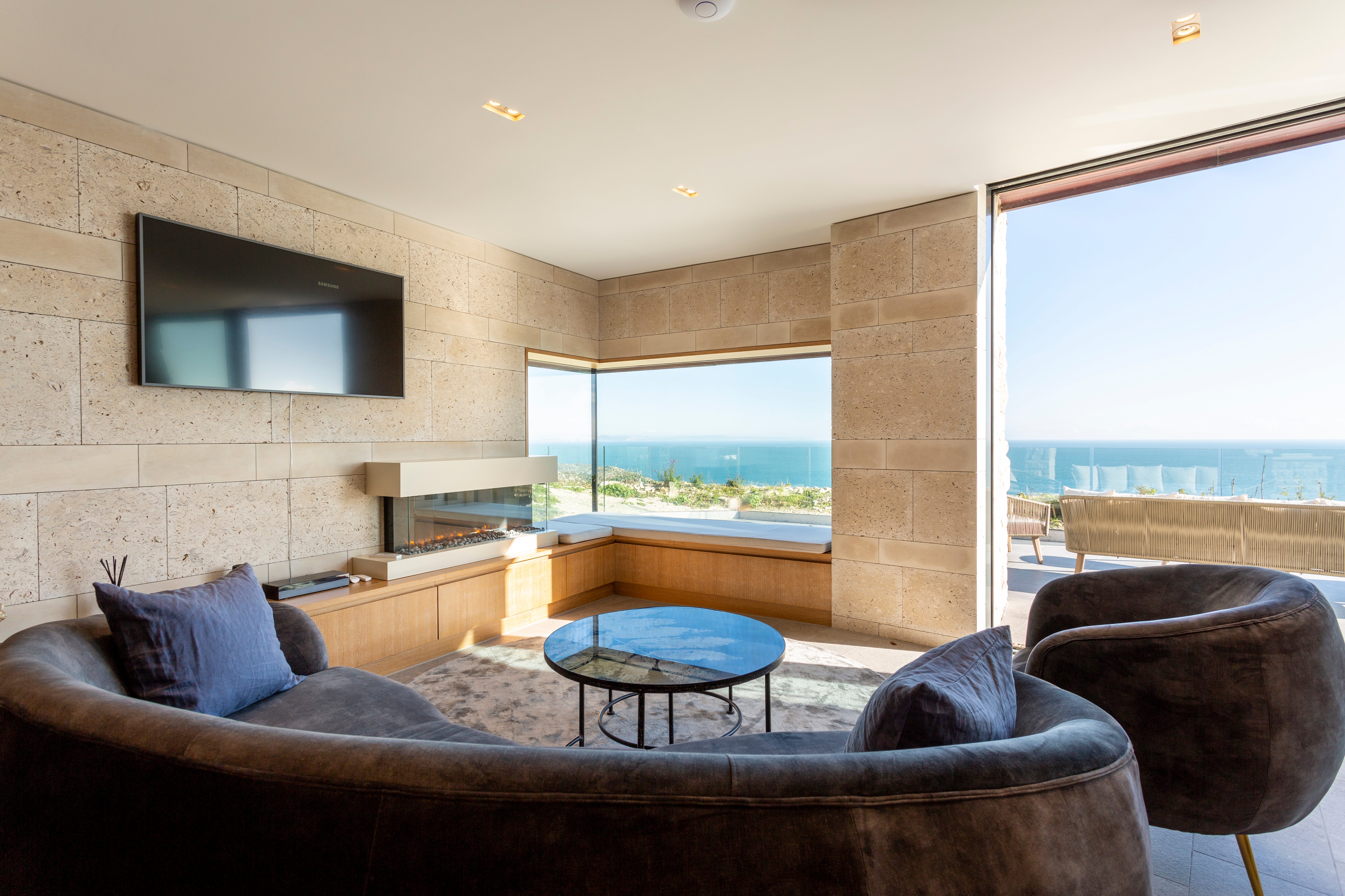
Located within the grounds of the Pennsylvania Castle Estate and perched on the edge of a rugged cliff, these waterfront properties were designed by architects Morrow and Lorraine to blend in with the surrounding landscape.
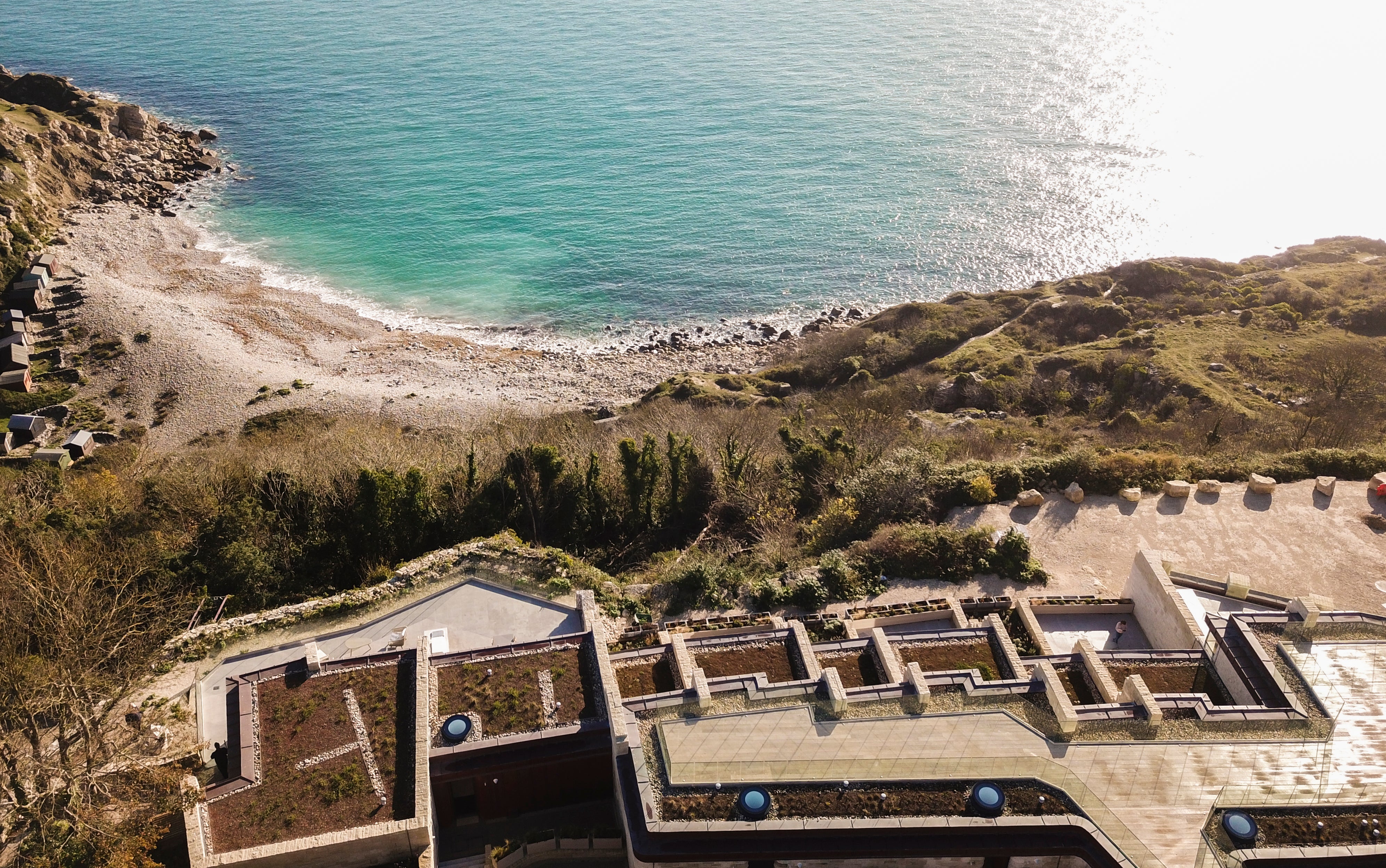
The interiors are clad in locally sourced Albion stone and ancient fossils, for which the Jurassic Coast is famous, can be seen on the walls and floors. Large windows link the indoors and out, encouraging relaxed contemplation of the coastal view. This is just one excellent example of homes that blend seamlessly with their surroundings.
“Careful renovation and thoughtful interior design, carried out in collaboration with local craftsmen and using local materials, are key to creating unforgettable spaces,” explains Kyra Millar, Product Knowledge Manager at Oliver's Travels. “This approach offers residents and visitors an authentic taste of a region's natural beauty and cultural richness.”
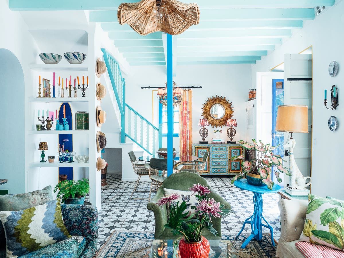
Many renowned designers agree with this idea and stress the importance of creating homes that are in harmony with their surroundings. In this article, they offer tips on how to dissolve the border between the outside and the inside, thereby satisfying our eternal longing for contact with flora and fauna.
Interior designer Matthew Williamson begins by saying: “When I design a home, I always start by immersing myself in the place. The key is to understand where we are in the world and allow that to shape the narrative.”
In the guest bathroom of her Mallorca home, for example, she was inspired by the nearby beach. “The wallpaper is adorned with painted shells, as a nod to the sea just beyond the walls. By incorporating elements that reflect the surroundings, the house becomes an extension of its surroundings,” says Williamson.
She tells me that color is an essential tool in achieving this and advises: “Always keep in mind the natural palette surrounding the space: in my own home, I have decorated with vibrant, coastal blues and greens. These colors are not just decorative choices, but they anchor the space in its context.”
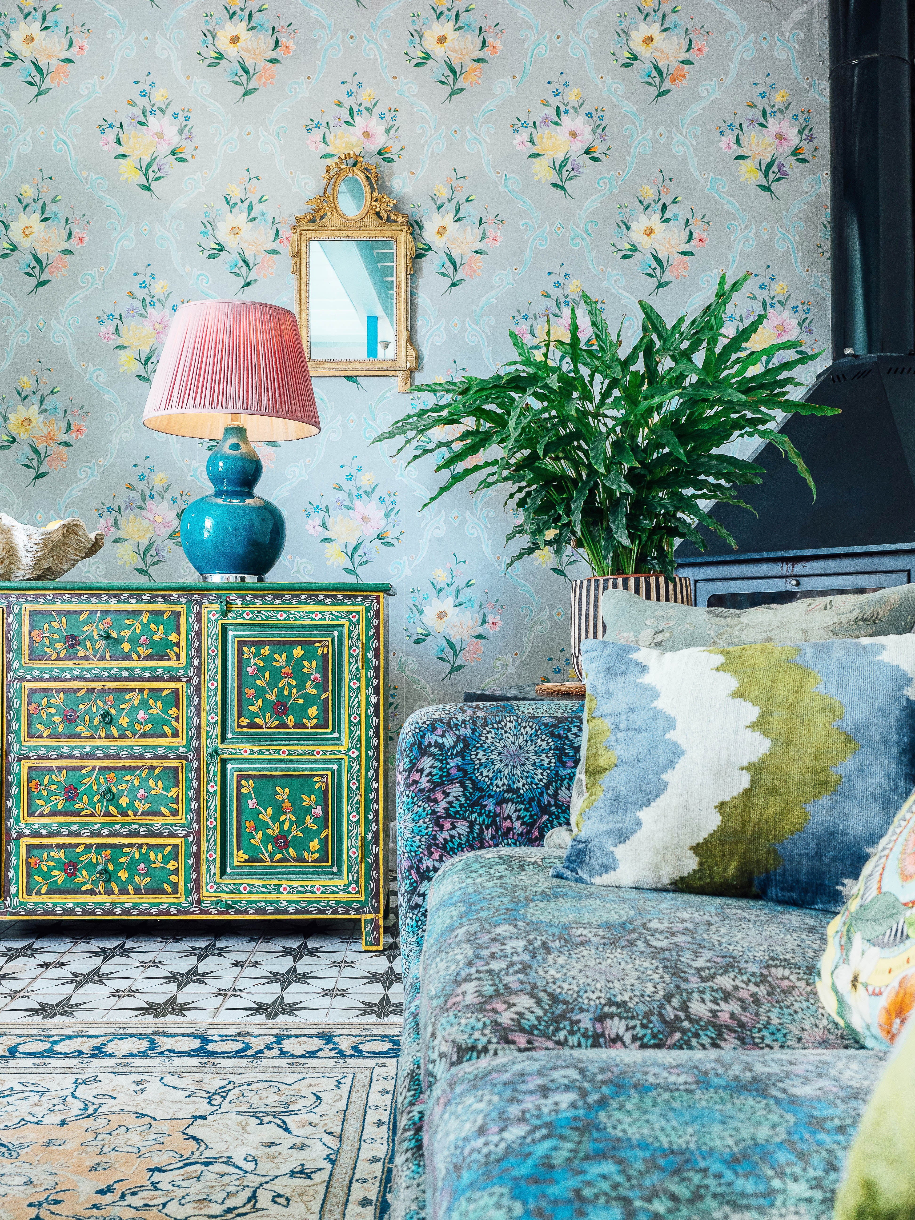
Laura Hammett, founder of the eponymous architecture and design studio, also recommends “using botanical prints to create synergy with the outdoors, mimicking the patterns of nearby nature. In one project, we commissioned a custom wallpaper for a dining room that looked out onto the beautiful garden behind. All the flowers were specifically chosen to complement the view, and a few butterflies were added to give it movement and life.”
Hammett recently designed a beachfront penthouse in the Bahamas. Here, she eschewed cliché beach motifs and opted for colors and textures that subtly evoke seaside relaxation. “We kept the tones calm and neutral, and incorporated glass pendant lights and decorative elements that mimic the look of water, rather than incorporating ocean references with overt blues,” she says.
Similarly, Alexander Shepel, co-founder of design studio and bespoke furniture manufacturing company SHEPEL', prefers to adopt a restrained colour palette. “When designing furniture for homes surrounded by lush greenery, I tend to use muted colours, such as warm creams. Pale tones act as a soft canvas that allows the eye to shine through,” he says.
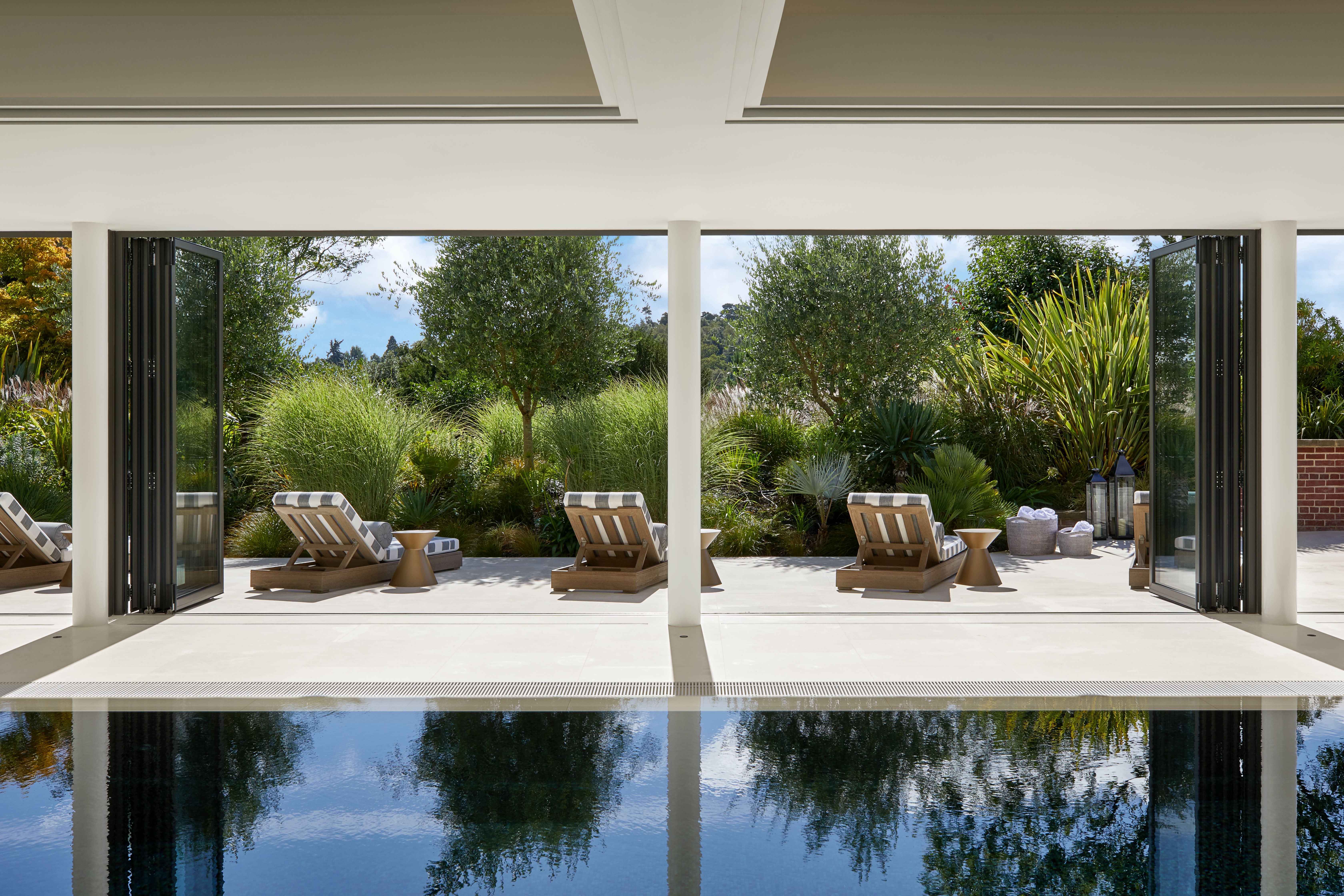
Shepel also recommends opting for floor-to-ceiling windows whenever possible. These create unobstructed views and welcome an abundance of natural light, fostering an open, airy feel.
“Prioritise the use of natural products, such as marble and wood, that are found locally,” emphasises Philippa Thorp, founder and director of Thorp Design Studio. Not only does this create an aesthetically pleasing look, but it is also a more environmentally friendly choice. Local products require less transport, which reduces fuel consumption and carbon emissions.
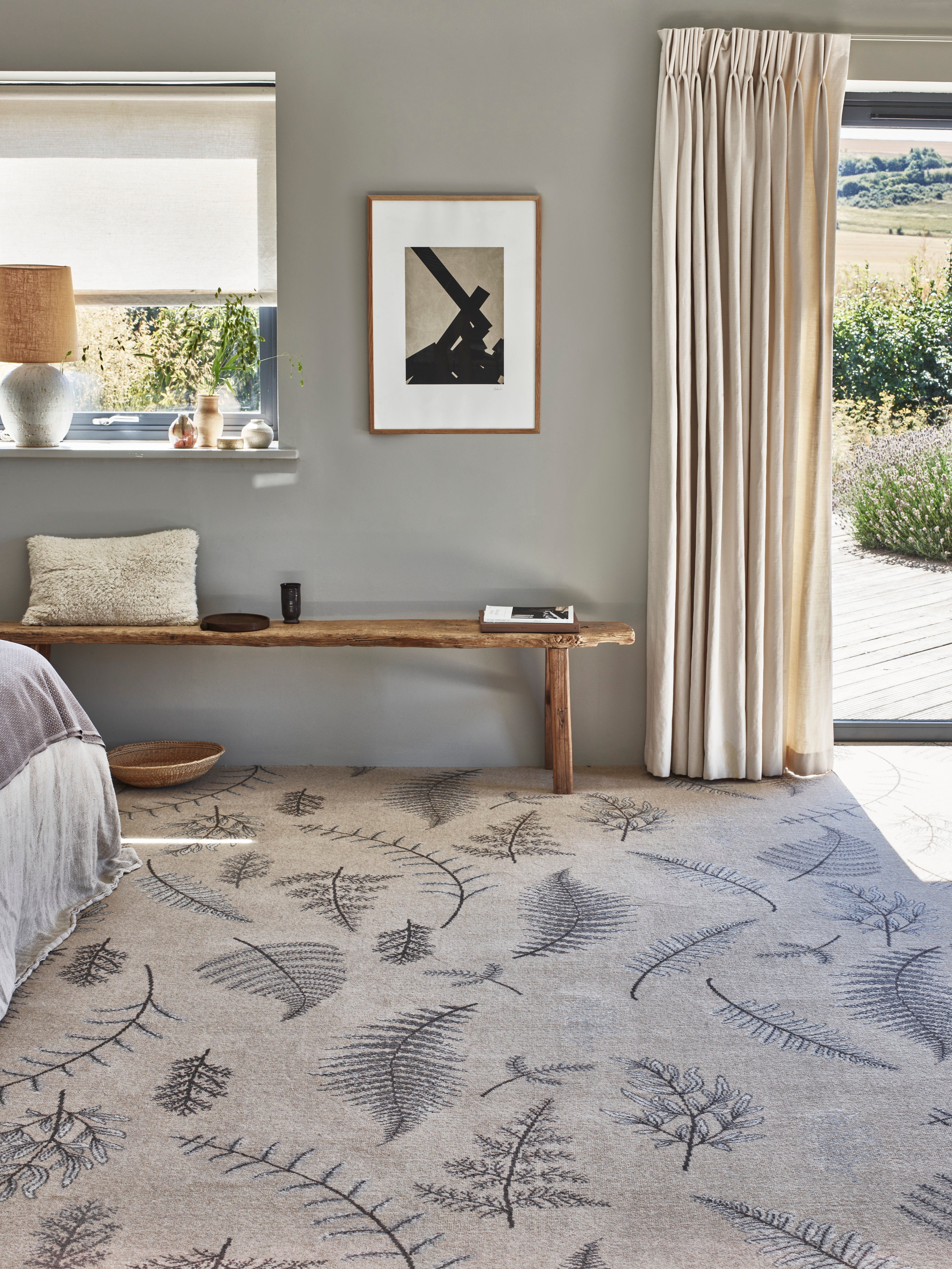
Considering your material palette from scratch can be a good place to start. Take a look at Brintons, who recently launched their Purely Natural range. These rugs are woven from 100% undyed British wool, perfect for adding organic warmth to a design.
“Using materials from a different region can be visually jarring,” Thorp explains. “For example, I once designed a house in Devon and the builder wanted to use Spanish slate throughout, because it was cheaper than locally sourced slate. But the colour of the stone just didn’t fit the context of the house. It had a completely different tone and pattern to what you find in the west of the country.”
Following Williamson’s approach, she concludes: “Ideally, primary tones should be the same inside and outside the home, creating a strong sense of continuity.”